
If you are an aspiring front end designer you will be seeing CSS Box Model everywhere. The whole web is basically built as a box. Every element that you write becomes a box, a rectangle one to be specific. If you are not familiar with the model, then you have landed to the right place. Today I will be covering CSS Box Model as my first tutorial.
What is CSS Box Model?
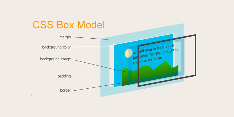
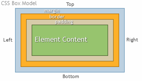
CSS Box Model is basically the layout foundation of the web. Every element you write becomes a rectangular box that consists with box’s content, padding, border and margin from inside out respectively. When you write any HTML tag it becomes a box. A “DIV” becomes a box, an “A” tag becomes a box, a “SPAN” tag becomes a box, and so on. Even if your “div” has a border radius and appears circular, for CSS it still is a rectangular box. So basically everything you write in a HTML is a CSS Box Model.
The boxes behaves in two ways. The first way is that it includes the padding and border to the width and height of the box model. The other way is that the width and height of the box model includes the padding and border. If that confused you, let me make it more clear to you.
We can control the behavior of the box model through CSS using the “box-sizing” property. The property allows you to include the padding and border in an element’s total width and height.
Without box-sizing property:
By default the width and height of an element is calculated as below:
width + padding + border = actual width of the element
height + padding + border = actual height of the element
This means when you assign a width/height, padding and border to an element. It appears larger than the actual width/height you had assigned.
With box-sizing property:
When you assign border-box value to the box-sizing property, it allows you to include the padding and border into your element’s width/height. So, if you do not want the padding and border to interfere with your element’s actual width/height, simply use the “border-box” value in your “box-sizing” property.
To learn more about box model visit this page.
Now that we have a little idea about CSS Box Model, let’s learn more about the types of boxes.
Types of CSS Boxes
There are basically three types of boxes that behave differently. The type is applied by the display CSS property. The property has block, inline and inline-block value.
A block box is a box that is stacked upon other boxes. Every new element that is a block level element always starts from new line regardless of the length of the content. The width and height of block level element can be altered from CSS directly.
An inline box is the opposite of the block box. It only takes the space of the length of the content and the width and height cannot be controlled from CSS.
An inline-block box is the in between box of both block and inline box. It inherits the property of both inline and block box. An inline-block level element only takes the space equal to the length of the content but its width and height can be controlled from CSS directly.
I hope that this article helps you in understanding the CSS Box model and the different types of box that’s available in HTML and CSS.